

NICK


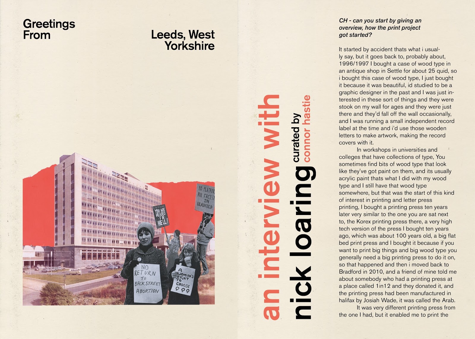
I wanted to produce a zine to showcase the interviews I had done, this would be inspired by both the postcards used and the people who are interviewed. Keeping to the styles that were made within the postcard development I produced a zine layout and style which could be emulated to become a series, using the same typeface as on the postcard (Akzidenz) and keeping to a simple layout that can incorporate imagery and large quotes from the interview. The colour choices are taken again from the postcard and used on large type, red to match the red on Nick Loaring's post card and the yellow based on Marko Wheatley's post card. With The print Project zine I used the photography I had Taken on my 35mm camera while visiting, this made the content and the interview feel more spread out, where as for Mark Wheatley's interview I used images of his work which I took from his website. The Print project interview felt more thought out and still now requires alot of work to make it ready for sale and print, yet both worked well and mock ups shall be made.
No comments:
Post a Comment