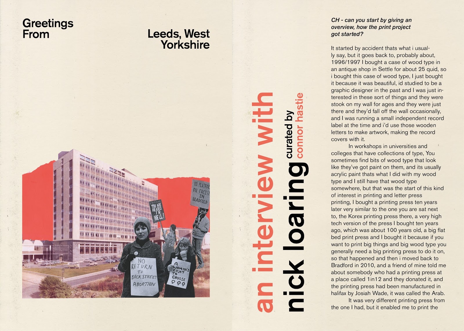
Nick Loaring - The Print Project
can you start by giving an overview, how the print project got started?
It started by accident thats what ill usually say but it kinda goes back further to probably about 1996/1997 i bought a case of wood type in an antique shop of some description in Settle for about 25 quid, so i bought this case of wood type, i just bought it cause it was beautiful, id studied to be a graphic designer in the past and i was just interested in these sort of things and they were stook on my wall for ages and they were just there and they'd fall off the wall occasionally, so there was that and I was running a small independent record label at the time and i would use those wooden letters to make artwork with, making the record covers with it. in workshops in universities and colleges that have collections of type, You sometimes find bits of wood type that look like they've got paint on them, and its usually acrylic paint thats what I did with my wood type and I still have that wood type somewhere, but that was the start of this kind of interest in printing and letter press printing and i didn't do anything for another ten years or so and I bought a printing press ten years later very similar to the one you are sat next to that Korex printing press there, a very high tech version of the press I bought ten years ago, which was about 100 years old, a big flat bed print press and I bought it because if you wanna print big things and big wood type you general need a big printing press to do it on, so that happened and then that printing press was in bits for years bout 3 or 4 years then i moved back to Bradford in 2010, and a friend of mine told me about somebody who had a printing press at a place called 1in12 and they donated it, and the printing press had been manufactured in halifax by Josiah Wade, it was called the Arab. It was very different printing press from the one I had, but it enabled me to print the type which I got in 1996 for the first time and it was the first time id ever used that type on that printing press, so that kind of kickstarted a really kind of mad journey which i’m still on essentially, which basically meant that i got immersed in another world of printing and printing design or printing through physical objects and predominantly at that time it was based on printing wood type cause thats what I was interested in like a lot of people kinda get into it through that cause they are beautiful objects, they're physical they have a history and quality to them so its quite a seductive thing i suppose, so that sort of happened and gradually i started to buy bits and pieces of equipment, i realised that if i wanted to do something i needed to start that sort of journey somewhere, I have bought printing presses, sold printing presses, and i have acquired things , got given things, bought things, I cleared out old print shops, so there is quite a massive period of activity in being able to pull these things together and I'm not particularly strong, not too technical, not too good with my hands as such (laughs) so it meant that basically i had to look into ways of moving the gear, lifting the gear etc. and so that kinda massive equipment started happening and that kind of was going on at 1in12 and at the same time happening outside my house and then eventually it got to the point where i was getting work, coming from various things which sorted setted in and it was 2013 that i moved in here and i moved in with three other people, friends of mine and they weren't printers or designers or anything like that and we rented this space behind the theatre and put everything in and thats kind of a part in history where it started but it changes all the time, equipment comes and goes and some of this equipment is quite hard to find, quite rare so i’ve got some good bits of kit in here thats because i realised that gradually i wanted to do things I've done, as you can see on the walls. I needed a press that could print posters, I needed a press that could make whole rooms of things, business cards and letterheads and such so theres a Heidelberg that does that, which is a classic printing press which was made in about 64 its a platinum press so its pretty common and its older than me, believe it or not. There’s a Farley proofing press, a British proofing press which is pretty basic theres a Vandercook proofing press at the back, I tend to use that basic model of proofing press. The Korex and the Heidelberg are much more high tech and more effort to use, theres an Adarna in here which I use for workshops, its a very kind of consumer level machine, theres a pantograph that I can make my own type with, theres a laser cutter outside which is something that has become quite a big part of what I do because It started out quite type based around found objects, and theres two distinct systems really in terms of there’s metal type which is cast on the shapes, theres wood type thats actually routed on the pantograph, so there’s a definite stick in the mud approach here I suppose, I've got kind of an appreciation for the old methods but at the same time there’s a sort of element of new, new technologies have been made which are cheaper to buy, so I've been able to buy a laser cuter and use that so its become a massive part of the process. So where it started in 2010, its changed, the type of work has changed, it’s big and bold graphic shapes. A lot of the rooting and the basis for the type of work i do now is routed in metal ornaments, so patterns, repetitions and shapes, thats something i’ve kind of latched onto over the years, became real quite fascinated by that sort of modular type things and sorts of things that cross over into the world of design, so thats kind of where I'm at still, still finding that stuff interesting, its meant I've developed a sort of style which i suppose i never expected, its quite geometric but quite acidic, psychedelic, so I've got a number of bits of equipment here to help me do that, and I could do it all on a computer if i wanted to really, but i thinks theres something about the physicality of this process that gives it a quality and it requires a different way of thinking and approaching how you do your work, you're limited by your printing press, in terms of the size and sometimes by the type that you have. So I've got a ludlow here which allows me to cast my own type so where i was in 2010, i was buying manky bits of type which were in cases. Theres various things in here that allow me to do a range of stuff in an interesting way. People involved in this scene are using letterpress in a more interesting way that kind of is different than what it was used for in the past, and i think thats one of the great things about letterpress that it teaches you a certain way to work and its better than an ink jet (laughs) I cant believe i just said that. Theres no pushing a button and it coming out the other end perfect, each stage of the process has loads of problems and loads of pit falls, its about working through it, so yeah thats how I kind of got here and where I am now.
CH- What were your inspirations, are there books, designers, influences?
I am undoubtedly influenced by things that have gone, and what have come from my past, i’m interested in skateboarding, punk music, making self publishing. Along the way loads of people I know have gone through these phases and Ive kind of ended up still here, and it feels weird, I stuk it out but like i remember being at school getting into skateboarding and people would take the piss out of me for that cause it was just considered to be stupid, but look at skateboarding now its part of mainstream culture, but people who used to kick sand in your face are wearing Vans shoes, you know so those subcultural signifiers, skateboarders, punks and so on there was an element of sticking together, those influences from skateboarding, like graphic art, that stuck with me. From skateboarding and the music came fan zines and I was making skateboard fanzines. Those things propelled me onto wanting to become a graphic designer, i went to college but spent more time in the pub, not really buckling down to what I needed to do, which was basically get good grades, pass it, get into the next stage of it and get into a degree, i didn't quite do that, i did get to do a degree in the end but that was for something different, but those early formative experiences, when i went to that college in Stafford, which I've since found out is known as a radical place for a rigorous typographical approach, i didn't know that at the time but i think some of the influence still lived on, as i came across people like Neville Brody, octavo, or Hamish Muir they're active now still and their approach was quite radical. This was just as the Apple Mac was coming about and these guys were doing this stuff, this really radical stuff at the time, through specifying everything and sending it off to somebody and it come back done, so this was a really hardcore approach that they had to typography, which i think i spent the next four or five years trying to emulate this style on computers and i never got anywhere near it, I didn't really know at the time what swiss typography was, didn’t know anything about that sort of stuff, but i knew about people like David Carson, he was involved with things like skateboarding, and he did a couple of magazines and lot of different stuff and it was a real grungy, dirty, gnarly style of graphic design, it was all sort of messed up, the typography all over the place and he was vilified and criticised for his style, but undoubtedly as a young person he had a massive influence on me.
Gradually I got into photography, and i became more influenced by magnum photographers and then eventually i did something completely different and came to Bradford and was more interested in using art as a community, and in a community setting, to do work that would enable good things, which sounds like a really lofty ideal at the time. So I came to Bradford college, saw the printing department but didn't get involved with it at that time, so i consequently missed out on all that but I got back into graphic design and got a job as a designer and that kickstarted a re-evaluation and a look into graphic design again and that spurred me onto design my own typefaces and look at modular approaches towards design and I was really interested in that, then consequently I got exposed to Swiss styles and dutch design, that type of thing and that, but I was also interested in psychedelic artwork too, being fascinated by early explorations of of visual art in a way it was graphic but didn't necessarily follow the rules of graphic design.
So those influences really, to a certain extent have come together in terms of the work I do now, though I don’t really follow graphic designers or graphic design agencies anymore, maybe because i’m a bit bored of looking at business stationary, i like graphic design thats got a message and is really strong. In some respects people say I'm an artist, I say I'm a printer, people say i’m a studio, I say workshop, I’m not a designer anymore, but maybe I am, I design through printing I suppose and all these machines enable me to do what I do because there was a realisation that the simplicity of it is key in a way, because the printing presses only really allows you to do so much before it gets too much and makes any sense visually. So its like strong vector based flat graphics work really well for letterpress, but half tones etc. not so good. I like posters cause I think they are a direct way to get something across to people, where as a book is something you can sit down and read, and kind of learn more from, but a poster can be an entry point for a discussion.
Now I don't really follow designers anymore, I’m aware of them and I've got friends that are designers and I'm sure they do great work and stuff but it doesn't really float my boat, I'm probably a bit blinkered in some ways cause I do just kind of seem to follow or watch printers or printers who are designers and one of the things Ive done, Double Daggers is about looking at other peoples work and being gobsmacked by what they do, so its looking inward to some extent. I still follow Swiss design but there is so much of it now that I cant really keep a track of it (Laughs). Graphic designers are going to repeat the styles because its part of the DNA of what we do so there is always going to be someone who makes some super cool minimalist design, and it always looks really great but it doesn't reinvent the wheel, it is the same thing over and over again in different permutation, but for that person who's doing it, it’s fucking amazing, so it would be easy to say that graphic designs rubbish but it’s not, it’s relevant to people who are involved with it and I think as someone older now, I've stepped away from it a bit, though I'm still fascinated by it, but its just that i cant keep track of it all. I think maybe thats good in a way, you step away and you don’t subconsciously absorb some of them styles and influences, you start to develop whatever it is you're doing and that becomes your own thing and I think as a designer you maybe encouraged to develop your own style but some graphic design doesn't rely on style it requires you to just input things into a computer and then it comes out the other end, because the role of the designer has changed a lot in the last 30 years, it used to be quite a demarcated business, now everyones a graphic designer, so theres a lot more designers and a lot more design and that doesn't necessarily mean theres a lot more good design, there is a lot of good design but there is also a lot of bad design and people pick up on bad design because its funny, like a bad bit of kerning theres a hilarity to that.
But yeah there is a lot of thought in what I do, there is a lot of thinking about and I've spent a lot of time on my own in here printing, so it means that I've had chance to, I wouldn't say formulate because that would imply I'm actually clever, but I've had chance to think about some of these things so I'm quite conscious of them but I'm also open, i’m quite happy to be proved wrong and to have a dialogue, a discussion about these things because I think it’s quite interesting as a human being in 2017 where we find ourselves, and theres a lot of design out there, but what is it doing, is it doing a good thing or is it just selling toothpaste? and there is nothing glamorous about selling toothpaste but there is a need for toothpaste, its a real thing but I think what it is about toothpaste is the fact that it gets sold over and over again, and I disagree with that, as well the fashion industry in terms that its just constant image making and what it does to peoples bodies and how thats reiterated and reinforced, and I think we can all agree that is not a good thing, but it isn't something thats going to stop because there is a lot of people involved in that industry who need to earn a living and they will do whatever it takes.
CH- You mentioned each different print press which you have here, which would your preferred machine be, which is your favourite or go to press in the workshop? Say for commercial work?
Well the press always plays a part in how I approach a job, the first thing is ‘what size is the job?’, if the sizes are bigger than A4 then it cant go on some of the presses, the Heidelberg is up to A4 so its designed to make long runs of things and small sizes, so that press can do printing, dye cutting, numbering, it does a few different things, so that press can be used for business cards or a small edition of something, an invite, something like that. In terms of like if somebody said to me I want two cards, it doesn't really work like that, essentially printings about repetition and multiples, the more you have in theory the cheaper the job is so printings about numbers. But the world im in now, the equipment is being used in much lower quantities than what it used to be so it means that effectively, i can print off 50 business cards or 20 but the problem with that is that it still costs quite bit of money to get it to go, to set it up and buy the paper, do the work and theres an expectation in a way that you can do these things and yeah I can do, but theres also the Korex proofing press, which is essentially its intended job is proofing, one of these would have been in a print works back in the day and one person would operate it, who'd put type on that would have been cast on the machine, then stick it on the press and proof it, and thats all it was for, it wasn't interpreted to be used to make a poster, but obviously it is big enough to make posters and what would printers do with the big wood type? The couldn't use it on the Heidelberg, as its just too small so they would be looking at presses. Some print works would have really big presses, to print really big pieces of wood type but some print works would only have a small amount of wood type because they didn't have a big press so the printer would do lots of different work, and it would be service work, posters, broadsides etc. So the presses tend to do different things but there is cross overs, I can do small jobs on the Korex too, but it would always be, if someone asked me what I can do, it would be more like ‘well what do you want?’, rather than spending all day telling you what I can do, if you come to me with an idea for what you want, then I can tell you if i can do it, consequently sometimes I can’t print posters that are very bigger than the ones on the wall, because the printing press is limited by size. So I've got two presses that I use that are high quality and that are intended to be used either by myself or for other peoples work and them two always get used and if I cant do the job then I just cant do it. Where as the other three presses in here, the Farley, the Vandercook and the Adana, they’re like really simple presses, you can do some really high quality work on the Adana, but it’s the type of press that I don't want to use because its just not what I want to do, the Farley and the Vandercook are very simple, theres a rougher, less exactness to the printing, though they're ideal for workshops because they're so simple.
So the two machines that i use the most are the Korex and the Heidelberg, but you can get a bigger version of the Korex and I will and that will enable me to go bigger and give me more space to manoeuvre on the page but i think there is a good thing in the limitations, working to those limitations and actually not always thinking ‘oh I could get a bigger one, I’ve got five typefaces that I can use on my computer, well actually I could just go buy that new one from such and such’ I dont think in terms of I can go and buy something to make money or do a specific job because in some respects it doesn't make any sense, when someone comes asking ‘I want some posters printing’ its like this is what I've got this is what I can do, so those things help formulate a way to approach a job.
Im in a funny position essentially what im doing is im using my computer to design things, to print things out on the printing press, using the limitations of the press to help me design artwork on the screen, so this is a really weird thing I've found myself in, what it used to be was moving things around on a stone, a flat metal surface, and what you cant do very well with letterpress type is visualise what its actually going to look like, as you have these physical objects in front of you and if its a geometric shape like a circle, you know what its gonna print like but if its not, if its like a right handed triangle, when you print it out it will be a left handed triangle and it’s being aware of those things, being aware of negative space and that some of the letters used will have a negative space on it but when you look at it physically from above you count the negative space as part of the design. The type all fits together, its like a modular thing, its all a system, it means that everything fits together in one way or another, that means that you've got a really amazing thing that you can actually develop very quickly, very easily, so anyone can pick up some type and start fitting it together and its really quite a liberating experience, but from then its like ‘Whats it going to look like?’- take a proof and go ‘oh hang on a minute, thats not really what I wanted’ well yeah because that thing there is physical, you've not taken account of this white space, you cant see what that looks like because you cant visualise it, so theres a real disconnect, because people cant work it out, its all backwards or its upside down and its not doing what i want it to do, because we become used to being on computers and having everything visually in front of us, its made us lazy in a way and one of the things I like about letterpress is that it forces you to approach things differently and it forces a contemplation and a slower approach, which isn't really intone with the modern world, and the modern world is a speedy, crazy thing, so consequently proofing of some type or whatever you have to spend a couple of days trying to figure out how it works and then even when its figured out, you might go ‘actually I don’t really like it’ and thats quite a challenge, its like knowing what you have and knowing you can go ‘not that typeface’ ‘not that ornament’ ‘not that one there’ and its being able to be familiar with what you’ve got before you put anything out because as soon as you start pulling anything out you've got to put it back and its very easy, as you can see, to amass stuff all over the place really quickly as every things physical.
CH - you mentioned using digital elements and you've mentioned fat out festival that you did work for, you used the laser cutter to make the shapes for print, what was the concept behind the work?
The concept behind it was just like ‘well can I do it?’ I don't know if I can cause I've got this thing on screen that I was like ‘fucking hell’ you know? thats doing it for me, thats hitting all the buttons, but can I do it? and I think we need to get this out there i’ll say that by doing a job thats just completely stupid, the amount of work that goes into it doesn't make it any better and it doesn't make it any worse and just because its letter press doesn't mean its better than anything else, theres a lot of bad letterpress stuff out there but there is a lot of elements that I push in what I do in that context because that is what I do and in terms of where I am geographically Im kind of one of the only people doing this weird stuff and thats not because I wanted to end up doing that its just because its just ended up being that way, I didn't set out with a plan to dominate the North or anything like that, i’m just doing what I do.
The Fat Out poster was something that existed digitally made when I worked a little late one Saturday night and I came back to it and thought yeah theres something there, you know, it’s done all the things i’d normally do, it’s repeating, it’s rotated, its a pattern and it’s symmetrical. It used what id normally do and so in some respects I hadn't really reinvented the wheel but what it would do, if I could get it to work, was it would be absolute madness and it would be absolutely fucking intense and it was absolutely fucking intense, i’d done some really stupid things in the past and I did some work for Magic Rock a couple of weeks back and I did a poster for Golden Cabinet about 3 or 4 weeks before Magic Rock and there was a bit of a testing ground, like can I print a bigger poster on a smaller printing press, and it turns out I can, but how much more work is it, and its double the work, but I was intrigued by that. I was like can I print this poster bigger than the press and have it so the joins not seen and we can we just have to be clever about where the join is and it started to dawn on me that effectively thats what we could do with this poster, so it did start out at a smaller scale. So I had to test it, I came in on a Monday, which was a week before the was to be made, in the run up to the festival. I started by thinking what happens if I cut one of thee pieces, does it work, they were super thin. So the laser cutter works in two ways, it cuts and engraves, so the engraving is removing parts of the surface, it burns away bits of it and the cutting aspect, is dead easy and quicker, really quick, where as engraving takes ages. So I cut a piece out on the cutter and I thought ‘okay, lets do it’ as I was convinced that it was good and it would work, so I spent a number f days cutting these little bits out and sticking them onto bits of wood, so all the bits were stuck on by hand, but the laser cutter fucked up quite badly, as it does sometimes, and so I had to adapt to that, so there was enough of the red blocks but i didn't get that far with the blue, cause the laser cutter, its not broken but I have broken three laser cutters in the past four years, because they are quite temperamental.
But yeah these are blocks or plates just stuck together so they're not particularly strong and when you combine the pressure of the press and the crap-ness of MDF, it starts to fall apart, so there was a lot of swearing, I did two all-nighters so I was fucking knackered, but it’s a challenge and I think thats good, and all the posters I've done, people really like them so thats really really lovely and i’m really honoured, but now it’s like what do I do next? Ive got a poster for Golden Cabinet what I have to do in the next few weeks and I've got big things coming through so. The Fat Out poster was really good I actually really like it as well, I like what it does, it ticks my boxes in a number of ways because it works in different ways, if you get up close to it does one thing if you walk away from it, it does another and if you walk even further away it does another thing so it’s blue and orange but it looks brown. But its a pattern, the pattern is the key, theres not that much typography.