Throughout the PPP module the way I design and the way I see my practice has changed, I have broadened the way I research for projects and also where I draw inspiration from, these skills have helped me identify my own personal design interests and approach to my work. During this self branding project I have struggled with how to approach it, feeling pressure once seeing my peers work and feeling I was doing something wrong, not being able to find confidence to express myself in fear of doing something wrong. As I progressed through the year my confidence grew and I realised how to approach it and a number of concepts that I could go down, the strongest concept to show me through self branding was my interest in music. I initially wanted to produce a multi platform logo but felt that this didn't show me as a designer, I am more of a hands on designer and like to produce something hand rendered (mono print screen print, traditional methods). I had to consider different methods of self branding and how others network with other creatives in the industry, considering social networking, business cards, logos and other such things, I wanted to produce something that showed both my personality and practice which lead me to consider screen printing, a process I am well versed in and confident doing. Whilst in the screen printing room at vernon street I was given inspiration when the head of the studio told me a story about someone printing onto dish clothes to promote his band, they were easily scrunched into a pocket and can be unravelled without the product being changed or ruined, which lead me to consider a cloth based product and someone suggested a tote bag, as I am known for wearing them.
I attempted a number of designs working with logos yet felt I wanted something interest to print onto tote bags, so I thought to compile a playlist of songs I like to listen to while I am designing, a mixture of different songs that are easy to listen to while working. I compiled this on Spotify so that it can be accessed publicly by anyone. Using InDesign I wrote up just 12 of these songs and there artists (12 because that is the average number on an LP) and struggled to put them into a good layout, so I experimented further and using the research of music cover art I tried out a style used by the band Vampire Weekend on there album 'Contra' by justifying the type to make it for a squared column of text, which looked to complicated when I used all 12 songs so I split it down to an easier size which made it work so much more successfully, the type was legible and looked neat. I prepared my screens for screen printing using these designs yet struggled at the beginning as I had never printed onto fabric and did not know it was a slightly different method to what I was used to, it required a different screen than the regular methods of printing and the beds were a fabric covered table which made alignment of the screen and the tote bag uneasy which resulted in a number of prints looking very off and wonky, these results were still interesting and unique, each bag turned out different which is why I chose to screen print, the unexpected and unpolished styles of design.
I felt my solution to the brief fully shows my practice and personality, letting people get a taste for the music I enjoy and design to as well as having a practical product. The Spotify playlist I compiled 'Songs to graphic design to' is open to the public and is getting requests from my peers to add songs which they design to, it is growing daily and is gaining more followers. I have been able to put my designs on social media which is good for my image as people will recognise my style and hopefully check out the playlist too.
Thursday, 17 March 2016
Wednesday, 16 March 2016
Screen Print


Whilst playing about with the layout of the type I attempted the Justify type setting like the style used on vampire weekends album 'Contra' which aligns the type like this splitting up to create a square, this way the type is split up wide and has a conformed layout. This style fills out the design and works well to create a legible and clean looking design. I wanted the type to go over the red circle so that it wasn't restricted, which again references the style I like to conform to within my work, being able to produce work and not following the guidelines.


I prepared the negatives for my screen as I would usually do it separating the two parts which will end up producing a two colour print. I had to double check I was doing this the correct way so that I did not waste time producing the wrong screens. I mocked up what I wanted the design to look like once printed onto the tote bag.

Final Solutions Self Branding

Having used the tote bag idea throughout my design process I attempted to produce a final solution using this method from my playlist design. It would have much more function than if my own logo was on it, the design of the songs on the tote bag would be taken out in public and worn more than a tote bag with my initials or name or contact details on. I felt this way would work a lot better as long as I produced a logo using the same aesthetic and design as this brand. I chose to screen print onto the tote bags as it is the most efficient method to produce a number of bags. Though I have screen printed a number of times onto paper using the screen printing beds I had never screen printed onto fabric before and was unaware it was a different process. It had some of the basics which are common in any form of screen print but required a different type of screen to if I was printing on to paper. It also required me to print on to a work top made from material, this different process created problems for me to figure out. I wanted to screen print to get a rough style of design as using these methods usually causes prints to come out obscured from the original design and often create a new look of design which in my opinion is usually more successful than the original clean idea. The first print of the red circle and the title of the design came out rather clean and how expected but above is the second print I did, the type came out fine yet the ink didn't fully penetrate and caused this effect on the circle which I feel is a lot more authentic and original, it is rough and looks worn which is a style I enjoy creating. I felt that as I went along the design changed slightly on each one which lead ti each tote bag being unique.
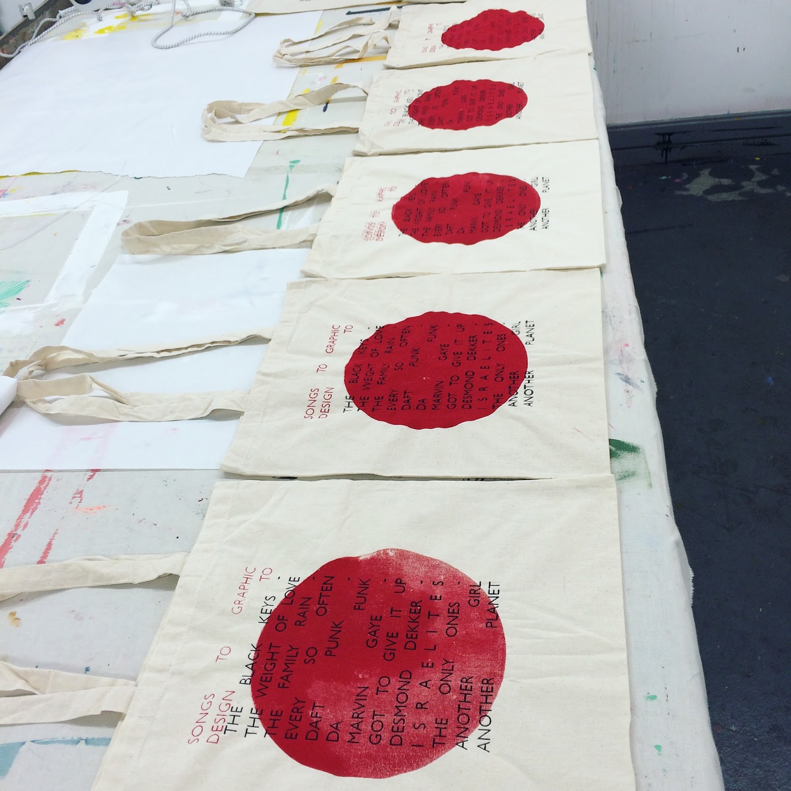

When printing the black type over the red circle I found it very difficult to find a perfect alignment and struggled to get a good balance on the separate designs, resulting in some of the bags to have the type low or high, yet these still creating unique and individual styles on each tote bag something I wanted to happen so that the bags represent my style, I knew what I would be getting into. By the last bag I had figured out a good method of which to align the bags with the type, which is why I am glad I left this one above to the end as it came out perfect in my opinion showcasing the roughness of the screen print style whilst also being near spot on to the layout on the original digital design.

I produced a small side design to hold more information about the tote bag contents and also to hold my contact details for when I network with other designers and for online purposes for my social networking sites such as Instagram and twitter. I have included the title of the spottily playlist that links to the tote bag which is available to follow and publicly listen to. I am adding a song each day asking people for contributions of songs towards it to keep it updated, fresh and growing genres. I have also included my email to contact me about my work and the playlist.


Design ideas

 For the designs of the playlist, I wanted to keep to the retro 60's/70's aesthetic which I like to design with. I looked at my own record collection and how they are set out and the visuals they use on the back of the albums, where the song contents usually is. I looked at how the type was set in a layout and tried to find use of a grid. I initially felt have the artist at one side in one column and the song title across from it in another column would be the best way to do it yet the 12 songs I started with all had different length titles and required me to break up the lists which didn't work very well. I felt it was jumbled and confusing. The visuals of block lines behind the type in bold colours (Blue and yellow, colours which I enjoy using and utilise when I can) these were too bright and bold and I felt I was producing the back of an album cover and felt I needed to step away from this style to produce something which can work on a range of different platforms. I attempted a range of shapes behind the text yet took major inspiration from some college work I did a year ago, which was a self written brief in which I produced an album cover. I used a similar Idea in one of the mock ups for this using a large red circle in the middle of the design. I continued with the type layout as it was to just see how the different shape would work. Having asked my peers they said the red circle was much more affective and also pays homage to work I have previously produced. Continuing my idea of using tote bags I felt the designs could work well on them so for each design I made I put onto a tote bag via photoshop to see how the design could work.
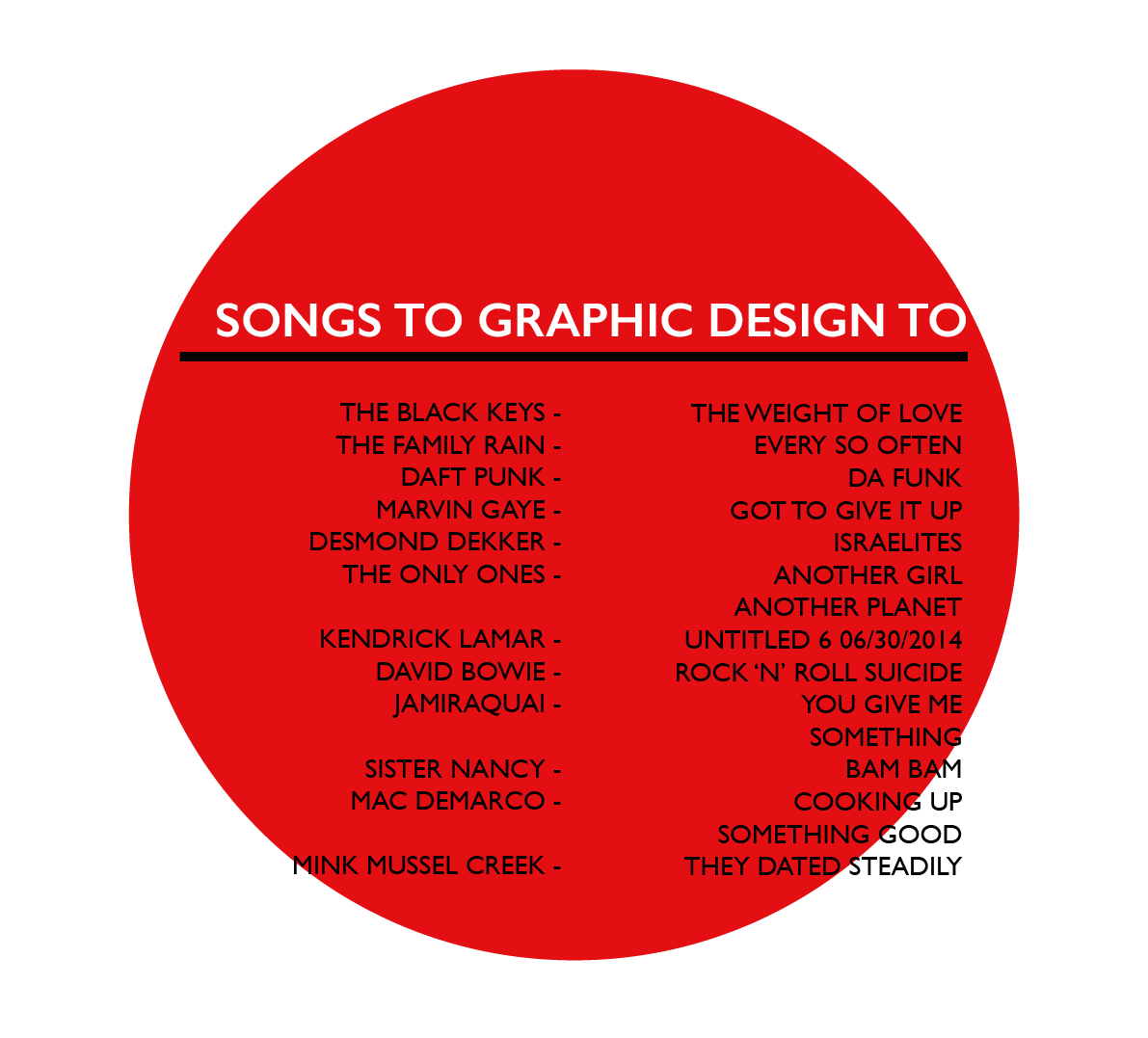


Tuesday, 15 March 2016
Jazz Records Inspiration
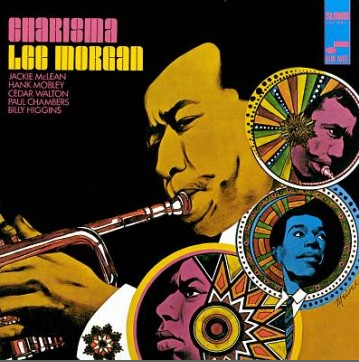
I was told about the music website Blue Note, a record company who deals mainly in jazz and blues. On there website is a timeline from 1939 when they were founded up to present day, it consists of all the record sleeves they have produced. I look on there for inspiration and found many album covers of which to take inspiration from. Taking Inspiration from the colours used, images and shapes. I prefer the rough shaped hand drawn ones, and the hand drawn/ photograph merged ones. I find the concepts behind these art works fascinating and the most engaging album art of all the genres of music. The music can be seen through the cover in some sense and I really like the idea of that.


Subscribe to:
Comments (Atom)