5 things you have learned so far on the programme
- In depth understanding of screen printing
- Range of bookbinding techniques
- Better Communication skills
- How to think outside the box
- To analyze my work critically
5 things that you want to know more about
- I want to know more about other computer softwares, particularly After Effects on Adobe.
- I want to know more about designers and open up my research so that I can Reference them in my work.
- I want to know about business and how to know what to price work and how to not get ripped off.
- I want to know about the different methods of production especially on zines and publications.
- I want to look more into identifying demographics for certain projects.
5 skills that you think are your strengths
- I consider screen Printing as one of my strengths and would like to apply it more in future briefs.
- I have a good grasp of Adobe InDesign and work well with the grids that are available to use.
- I am confident with working in a group to produce a final outcome.
- I am strong with basic book bnding and publication production methods.
- I am confident with printing into fabrics using analog methods.
5 things that you want to improve
- I would like to try more methods of producing work, some new processes (i.e different print methods, both digital and Analog.
- I would like to improve my hands on skills, to create more hand rendered products and mock ups.
- I would like to improve my critical writing skills and also essay writing skills.
- I should look at more books which relate to my briefs, particularly for context of practice to get a wide range of talking points to go towards my essay.
- I must improve my time management skills, and beable to record my time tables better. Look at making calendars and time plans.
5 practitioners that demonstrate your interest in graphic design
- Jamie reid - English Artist and anarchist ( Well known for his work with band The Sex Pistols)
- So Young Magazine
- Romek Marber
- Kalle Lasn
- Shonagh Rae
5 websites/online resources that demonstrate your ares of interest within the creative industry
- Instagram Account - Youth Club Social
- Instagram account - Idea.ltd
- http://dimashiryaev.tumblr.com/
- http://www.craigatkinson.co.uk/Books-Zines
- http://www.paintbynumber.co.uk/blackbook/lydia-blakeley
Wednesday, 16 November 2016
Thursday, 10 November 2016
Profesional visitor - 10/11/16
Harrison Park, Former LCA student
- Build Relationships, with professionals, conversations
- It is not handed to you on a plate
- Sell Yourself
- Be Flexible
- Have Personality
- Be Strong
- Don't be a Dick
- Don't be afraid to ask
- Rejection Happens
- Stay True to yourself
- Communicate
- Studio DBD - Petal&Co - Skiddle
To keep a float you do small projects to pay the bills, these wont be seen as they are not as glamorous as the big low paid jobs which are more exciting.
Make contacts with visiting professionals, build bridges and get to know them. Everyones Human. Think outside the box when contacting studios and designers. Play on creatives egos. Be different, be surprising and make yourself stand out. Tell a story through different means and different medias. Take a placement, build experience working in a true creative environment, even if its just making cups of tea, stick to it and keep passionate. Keep emailing for jobs and to professionals even after rejection, keep striving towards the goal and leave a good lasting impression with them.
Monday, 31 October 2016
Pastiche
Fredric Jameson is an American Literary critic and Marxist political theorist,
"In this situation parody finds itself without vocation; it has lived and that strange new thing pastiche slowly comes to take its place. Pastiche is, like parody, the imitation of a peculiar or unique, idiosyncratic style, the wearing of a linguistic mask, speech in a dead language. But it is a neutral practice of such mimicry, without any of the parodies ulterior motives, amputated of satiric motives, devoid of laughter and any conviction that alongside the normal tongue you have momentarily borrowed, some healthy linguistic normality that still exists. Pastiche is thus blank parody a statue with blind eyeballs: it is to parody what other interesting and historically original modern thing, the practice of a kind of blank irony." - Frederic Jameson Parody and Pastiche
Jameson feels that post modernist architecture is out of context and pointless.
Nostalgia films - extends parts of periods of times, blows up something to make a point within a film, over exaggerating things to bloat the facts for information, jameson has an issue with this as the false ideologies become integrated into peoples minds making them believe that this over exaggerated thing is the truth.
Linda Hutcheon is a Canadian academic who works in literary theory and criticism, opera, and Canadian studies. Her paper, The Politics of Postmodernism: Parody and History, looks at distinguishing the difference between modernism and post modernism. Hutcheon believes post modernism has basis as it is a parody of modernism. It is a defensive piece against people who slam Post modernism in essays.
"On the surface, postmodernism's main interest might seem to be in the processes of its own production and reception, as well as in its own parodic relation to the art of the past. But I want to argue that it is precisely parody -that seemingly introverted formalism -that paradoxically brings about a direct confrontation with the problem of the relation of the aesthetic to a world of significance external to itself, to a discursive in other words, to ideology and history."
Jameson thinks that parody before has become pastiche, while Hutcheon it is all parody as it has an effect on things.
Jameson says
- Pastiche
- Parody becomes pastiche
- Non political
-De-historicising
-The Past as code
- Modernism is most important
-Post modernism is capitalist
Hutcheon
-Parody
-Parody is pastiche
-Politically charged / critical
-re-reading of the past
- Incorporated
-post modernism is most important
-Modernism is capitalist
Thursday, 13 October 2016
Weaknesses in my practice
The weaknesses I found I had in my practice during first year hindered my progress in some ways, through identifying them I can approach and find simple solutions to them. In the first year of PPP I was looking for the type of practice I enjoy and most relate to and was building on that as well as engaging in different aspects of the creative world such as magazine launches, exhibition and gallery visits, attending lectures and reading up on my subject as well as other aspects of the creative world.
I found that in the first year of doing this I struggled most with being able to find different creative events which I would have enjoyed going to, I feel I didn't attend enough live events or lectures as I was unaware of them until after they had happened, I need to do better to keep up to date with websites such as Creative Review, Its Nice That and other such design based websites which advertise events and creative experiences, by doing this I will broaden my view and open myself up to different positive opportunities.
Within PPP it is expected that everyone presents a 10 minute long power point speaking about there practice, interests and experiences within there subject, though I have no issue presenting and speaking to a large group of people, I find it extremely daunting to speak about myself and the style of practice and as well telling people my interests and also future aspects, I need to work on this so that I can present a more free flowing presentation which is engaging and interesting, in the first year I felt that I was held back through embarrassment of having to just talk about me, I need to open up more and be able to articulate my interests, aims and goals.
Personal branding was something I struggled on also, having to create something which is meant to represent you is a tricky complex, I struggled to identify with any form of branding, especially early on in my studies, I intend to try and understand my practice better and be able to brand my self with something I relate to and which relates to my practice and personal interests and styles.
Wednesday, 12 October 2016
Looking at design studios
Buttercrumble -
Abigail and Chloe, design duo known as Buttercrumble, they believe in the power of good design which will inspire and change something. They're inspired by mid-century design, folk illustrations, Scandinavian design, stories and life, themselves saying 'Sweetness is out weakness'.
Buttercrumbles core values


Contributing Artists -
@Chatshowcharlie - Charlotte Weston
Sculptor artist, Photographer and designer.

@pseudobruitismus_africamus
Collage artist


 Branding for the Australian design conference, Sex Drugs & Helvetica. Referencing the irreverent title of the conference they built the identity around a system of illustrations and pictograms. Each one referencing a part of the title of the conference. Alongside posters, t-shirts, tote bags, programmes, banners, lanyards and wristbands, build also designed a website and an accompanying social media campaign.


Abigail and Chloe, design duo known as Buttercrumble, they believe in the power of good design which will inspire and change something. They're inspired by mid-century design, folk illustrations, Scandinavian design, stories and life, themselves saying 'Sweetness is out weakness'.
Buttercrumbles core values
- Smile - Illustration and design makes us smile and we aim to produce work which develops your brand and makes your audience smile
- Collaborate - Our culture is all about collaboration. Our business was formed on collaborating and we are always looking to collaborate with other creatives.
- Foundations - We believe you can not create great designs from weak foundations which is why we work hard on every stage of the project including research.
Work -
Giclee and Risograph prints- exhibit at The Gallery in Munro House (Leeds) in May 2016. The exhibition was a celebration of women, art and food as part of the Leeds Indie Food Festival.


Small interesting prints showing the different cafes which Buttercrumble frequent, the prints a detailed and colourful, while the 'Banana Yoga' prints are simplistic, yet still remain interesting and vibrant to view.
So Young Magazine
So Young is a gift to you under the assumption that you keep going to gigs, buying records and looking at the sleeve artwork as you listen. With a community spirit, So Young aim to bridge the gap between some of the newest talents within illustration and the thriving underground guitar music scene. They are inspired by fanzines from the punk era but with a much more positive outlook. It’s about documenting what is going on right now up and down the country and overseas in pubs, clubs, squats and living rooms. In a time of disposable music and art, So Young is a printed publication, fully illustrated by emerging and contemporary illustrators, our limited print runs make So Young an item to be collected and treasured.
Contributing Artists -
@Chatshowcharlie - Charlotte Weston
Sculptor artist, Photographer and designer.
Collage artist

@tarabooth
Illustrator, collage artist. Worked on The Wytches second album.

@joshwhettingsteel
Editor of So Young Magazine/ Illustrator/ Collage artist

Build Studio -
Utilising Graphic design alongside art direction, image-making, moving image and typography they specialise in creating visual communications for forward-thinking clients in the design led sector.
Builds' many different international clients include Virgin America, Made.com, Getty Images and Nike, as well as a number of independent businesses and designer-makers, and events both in the UK and abroad.
Work -
Sex, Drugs & Helvetica - Conference Branding
 Branding for the Australian design conference, Sex Drugs & Helvetica. Referencing the irreverent title of the conference they built the identity around a system of illustrations and pictograms. Each one referencing a part of the title of the conference. Alongside posters, t-shirts, tote bags, programmes, banners, lanyards and wristbands, build also designed a website and an accompanying social media campaign.
Levi's -
A collaboration with Bob Sheard/Fresh Britain for Levi's. With a Brand vision of 'Authentic Expression' developed by Fresh Britain. A new typographic visual language by Build. Working with the team at Fresh Britain to align, and reinforce the brand vision for 'Authenticity', build developed a typeface informed and constructed using Levi's arcuate.


Tuesday, 4 October 2016
PPP - Paris - Takashi Murakami
TAKASHI MURAKAMI - GALERIE PERROTIN
Visiting a number of galleries over the course of my time in Paris, one which had left the most lasting impression was the Takashi Murakami exhibition at the Galerie Perrotin, Murakami is a contemporary Japanese artist whose work is easily recognisable through his own style which has become renowned. Murakami uses a number of different media, from sculpture to print and each with its own distinctive look, he also works with commercial media such as animation, fashion and merchandise. Murakami founded the art movement 'Superflat', which takes influence from anime and manga and other consumer forms of art in Japan. Murakami is highly praised for his work, which is said to blur the line between high and low art.


Many of the pieces in the exhibition were unique and individual pieces, though many pieces had a similar style, the exhibition was a good mixture of all of Murakami's work, it showcased his different styles and medias used. Murakami worked a lot with plastics and thick acrylic, this gave the work a shine and the light hits off of them and really shows the colours and angles off. It is easily seen that he combines commercial art with fine art creating work which content can be seen as 'weak' and be showcasing it as art with bold colours and a strong form, this sculpture above, for example, uses anime/manga style skulls as a gold wall piece, this combination makes for a unique and interesting piece.


Murakami's painted pieces are all to a very large scale and as seen in this piece it can be seen that he uses a number of painting techniques, one being spray painting, using this a means to write type or as a background layer to bring out his foreground content. Again using the anime/manga style of characters and colour choices, in this piece, he also combines it with old Japanese styles and symbols such as can be seen in this piece a dragon, this combination of styles makes the piece more visually powerful, because of its contrasts in styles and content.

Another example of Murakami's style change, this self-portrait style sculpture stood out within the exhibition as something completely different from all his work. Though it has the face of Murakami the rest of the sculpture is fantasised to resemble a god. Murakami has a vast and diverse portfolio which inspires me to be diverse and changeable within my own work.


PPP Paris - Erasmus Failure
During studies in first year an opportunity arose to study abroad for the first semester of second year, through a programme called ERASMUS which the university and many other universities around the world run which offers students the chance to study for a short period of time in a foreign country, I chose to apply to Paris, France to study at the Ecole Nationale Superieure des arts decoratifs, choosing this university for their excellent methods of teaching and facilities.
This university is taught solely in French which meant I had to learn and continue to learn whilst I was there, unfortunately this is something I struggled with more than I expected, especially when it came to attending the university for the first times, much of the staff could not speak English and my french was still weak, only managing some sentences and this communication barrier meant I struggled to navigate around the university and not engage with the tutors and other students I met. As well this language barrier meant that looking for further accommodation whilst I was there was immensely difficult, many of the letting agents did not rent out to non-french speaking tenants, this hindered me finding places to live which were within my budget. These complications meant that I had to return home after just 1 month of being there, despite best efforts to find accommodation and make it work, it just did not happen, though my time over there was not wasted as I was able to visit many inspirational places and see many great things whilst I was there. Now returning to studies I can use what I have taken from my short time there and put it to use in my work.


I was able to walk around the city and enjoy the sights of new surroundings, Paris is known for its art and culture and this can be seen through every neighbourhood through shops, street art and the people, it is a busy city, especially in comparison to Leeds, the people take pride in the diversity and culture more so than in England. The street art, for example, there is a pride and effort gone into it, this is just one of a lot of street graffiti I saw and all of it felt considered, it was not mindless spraying but really interesting pieces, usually with a message or purpose.

I was able to see all the main tourist sites whilst in Paris though these were the most crowded places, and which meant I could not go in or get up to close to them. Though visiting the Notre Dame was very influential I was able to walk around its outside and take in the architecture and sounds from around the cathedral, it is a stunning building with so much detail and artistic value, it is clear to see why it is an iconic building.


Throughout the city, there are many churches, exhibitions and places of art and creativity, one of the best places which I visited was the Stravinsky Fountain, near the centre Pompidou, it is a beautiful fountain square with one or two cafes on and the church of Saint-Merri, the fountain is full of sculptures, 16 all brightly coloured and different shapes and sizes, each represent the work of composer Igor Stravinksy. The surrounding areas are full of street art and also performers, it is a brilliant place where people sit and take in the art.
Thursday, 17 March 2016
Evaluation
Throughout the PPP module the way I design and the way I see my practice has changed, I have broadened the way I research for projects and also where I draw inspiration from, these skills have helped me identify my own personal design interests and approach to my work. During this self branding project I have struggled with how to approach it, feeling pressure once seeing my peers work and feeling I was doing something wrong, not being able to find confidence to express myself in fear of doing something wrong. As I progressed through the year my confidence grew and I realised how to approach it and a number of concepts that I could go down, the strongest concept to show me through self branding was my interest in music. I initially wanted to produce a multi platform logo but felt that this didn't show me as a designer, I am more of a hands on designer and like to produce something hand rendered (mono print screen print, traditional methods). I had to consider different methods of self branding and how others network with other creatives in the industry, considering social networking, business cards, logos and other such things, I wanted to produce something that showed both my personality and practice which lead me to consider screen printing, a process I am well versed in and confident doing. Whilst in the screen printing room at vernon street I was given inspiration when the head of the studio told me a story about someone printing onto dish clothes to promote his band, they were easily scrunched into a pocket and can be unravelled without the product being changed or ruined, which lead me to consider a cloth based product and someone suggested a tote bag, as I am known for wearing them.
I attempted a number of designs working with logos yet felt I wanted something interest to print onto tote bags, so I thought to compile a playlist of songs I like to listen to while I am designing, a mixture of different songs that are easy to listen to while working. I compiled this on Spotify so that it can be accessed publicly by anyone. Using InDesign I wrote up just 12 of these songs and there artists (12 because that is the average number on an LP) and struggled to put them into a good layout, so I experimented further and using the research of music cover art I tried out a style used by the band Vampire Weekend on there album 'Contra' by justifying the type to make it for a squared column of text, which looked to complicated when I used all 12 songs so I split it down to an easier size which made it work so much more successfully, the type was legible and looked neat. I prepared my screens for screen printing using these designs yet struggled at the beginning as I had never printed onto fabric and did not know it was a slightly different method to what I was used to, it required a different screen than the regular methods of printing and the beds were a fabric covered table which made alignment of the screen and the tote bag uneasy which resulted in a number of prints looking very off and wonky, these results were still interesting and unique, each bag turned out different which is why I chose to screen print, the unexpected and unpolished styles of design.
I felt my solution to the brief fully shows my practice and personality, letting people get a taste for the music I enjoy and design to as well as having a practical product. The Spotify playlist I compiled 'Songs to graphic design to' is open to the public and is getting requests from my peers to add songs which they design to, it is growing daily and is gaining more followers. I have been able to put my designs on social media which is good for my image as people will recognise my style and hopefully check out the playlist too.
Wednesday, 16 March 2016
Screen Print


Whilst playing about with the layout of the type I attempted the Justify type setting like the style used on vampire weekends album 'Contra' which aligns the type like this splitting up to create a square, this way the type is split up wide and has a conformed layout. This style fills out the design and works well to create a legible and clean looking design. I wanted the type to go over the red circle so that it wasn't restricted, which again references the style I like to conform to within my work, being able to produce work and not following the guidelines.


I prepared the negatives for my screen as I would usually do it separating the two parts which will end up producing a two colour print. I had to double check I was doing this the correct way so that I did not waste time producing the wrong screens. I mocked up what I wanted the design to look like once printed onto the tote bag.

Final Solutions Self Branding

Having used the tote bag idea throughout my design process I attempted to produce a final solution using this method from my playlist design. It would have much more function than if my own logo was on it, the design of the songs on the tote bag would be taken out in public and worn more than a tote bag with my initials or name or contact details on. I felt this way would work a lot better as long as I produced a logo using the same aesthetic and design as this brand. I chose to screen print onto the tote bags as it is the most efficient method to produce a number of bags. Though I have screen printed a number of times onto paper using the screen printing beds I had never screen printed onto fabric before and was unaware it was a different process. It had some of the basics which are common in any form of screen print but required a different type of screen to if I was printing on to paper. It also required me to print on to a work top made from material, this different process created problems for me to figure out. I wanted to screen print to get a rough style of design as using these methods usually causes prints to come out obscured from the original design and often create a new look of design which in my opinion is usually more successful than the original clean idea. The first print of the red circle and the title of the design came out rather clean and how expected but above is the second print I did, the type came out fine yet the ink didn't fully penetrate and caused this effect on the circle which I feel is a lot more authentic and original, it is rough and looks worn which is a style I enjoy creating. I felt that as I went along the design changed slightly on each one which lead ti each tote bag being unique.
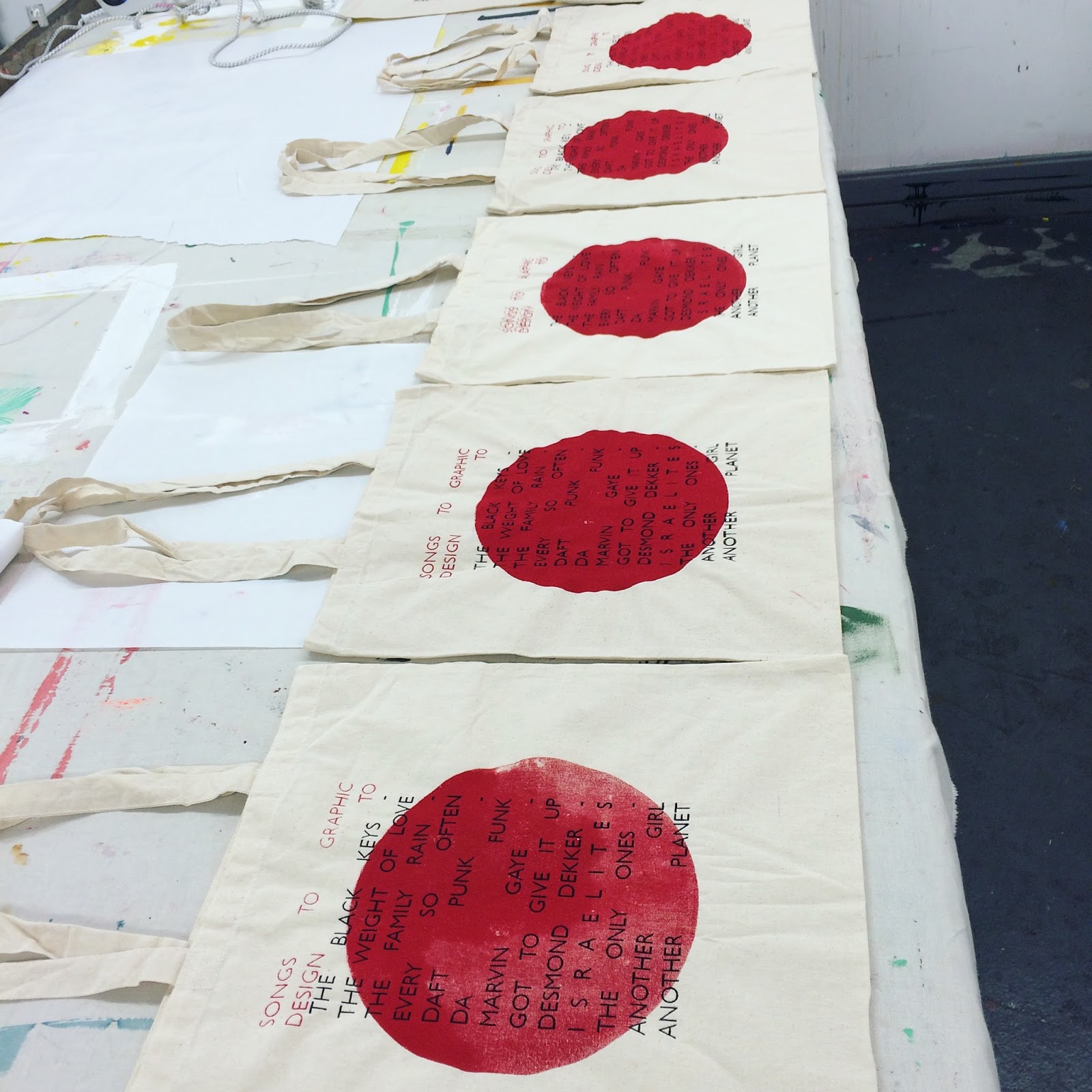

When printing the black type over the red circle I found it very difficult to find a perfect alignment and struggled to get a good balance on the separate designs, resulting in some of the bags to have the type low or high, yet these still creating unique and individual styles on each tote bag something I wanted to happen so that the bags represent my style, I knew what I would be getting into. By the last bag I had figured out a good method of which to align the bags with the type, which is why I am glad I left this one above to the end as it came out perfect in my opinion showcasing the roughness of the screen print style whilst also being near spot on to the layout on the original digital design.

I produced a small side design to hold more information about the tote bag contents and also to hold my contact details for when I network with other designers and for online purposes for my social networking sites such as Instagram and twitter. I have included the title of the spottily playlist that links to the tote bag which is available to follow and publicly listen to. I am adding a song each day asking people for contributions of songs towards it to keep it updated, fresh and growing genres. I have also included my email to contact me about my work and the playlist.


Design ideas

 For the designs of the playlist, I wanted to keep to the retro 60's/70's aesthetic which I like to design with. I looked at my own record collection and how they are set out and the visuals they use on the back of the albums, where the song contents usually is. I looked at how the type was set in a layout and tried to find use of a grid. I initially felt have the artist at one side in one column and the song title across from it in another column would be the best way to do it yet the 12 songs I started with all had different length titles and required me to break up the lists which didn't work very well. I felt it was jumbled and confusing. The visuals of block lines behind the type in bold colours (Blue and yellow, colours which I enjoy using and utilise when I can) these were too bright and bold and I felt I was producing the back of an album cover and felt I needed to step away from this style to produce something which can work on a range of different platforms. I attempted a range of shapes behind the text yet took major inspiration from some college work I did a year ago, which was a self written brief in which I produced an album cover. I used a similar Idea in one of the mock ups for this using a large red circle in the middle of the design. I continued with the type layout as it was to just see how the different shape would work. Having asked my peers they said the red circle was much more affective and also pays homage to work I have previously produced. Continuing my idea of using tote bags I felt the designs could work well on them so for each design I made I put onto a tote bag via photoshop to see how the design could work.
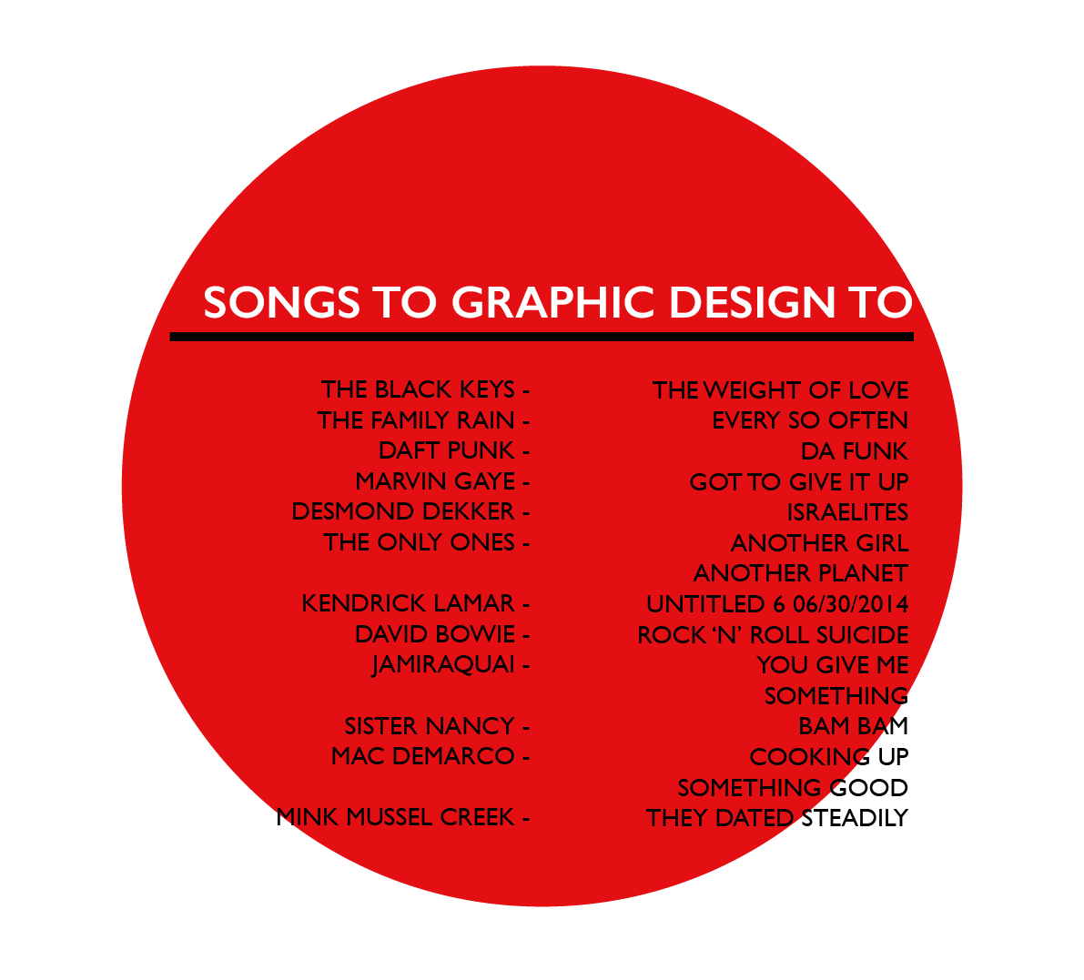


Tuesday, 15 March 2016
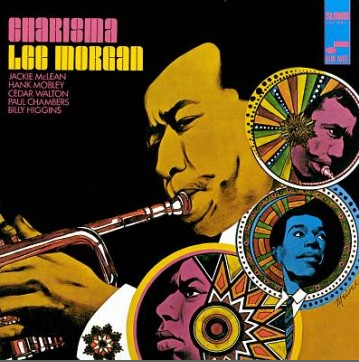
Jazz Records Inspiration
I was told about the music website Blue Note, a record company who deals mainly in jazz and blues. On there website is a timeline from 1939 when they were founded up to present day, it consists of all the record sleeves they have produced. I look on there for inspiration and found many album covers of which to take inspiration from. Taking Inspiration from the colours used, images and shapes. I prefer the rough shaped hand drawn ones, and the hand drawn/ photograph merged ones. I find the concepts behind these art works fascinating and the most engaging album art of all the genres of music. The music can be seen through the cover in some sense and I really like the idea of that.


Subscribe to:
Comments (Atom)