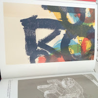
I had this book from a while ago, it looks at contemporary art used within music, sleeve design, posters, record stickers etc. Having Looked through it I found a number of inspirations which I will take ideas from, many of which I found were collage style designs and some of hand rendered illustrative design too. I found that the rough style of design such as the St Vincent and the East of the wall posters had a rough texture and a grainy old effect used on them which is another style I would love to attempt. The way the East of the wall album cover looks like a 1970 design especially with the worn style of cover making it look like it is from another era is a great idea, it plays homage to the design which the band loved.


No comments:
Post a Comment