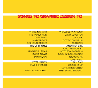
 For the designs of the playlist, I wanted to keep to the retro 60's/70's aesthetic which I like to design with. I looked at my own record collection and how they are set out and the visuals they use on the back of the albums, where the song contents usually is. I looked at how the type was set in a layout and tried to find use of a grid. I initially felt have the artist at one side in one column and the song title across from it in another column would be the best way to do it yet the 12 songs I started with all had different length titles and required me to break up the lists which didn't work very well. I felt it was jumbled and confusing. The visuals of block lines behind the type in bold colours (Blue and yellow, colours which I enjoy using and utilise when I can) these were too bright and bold and I felt I was producing the back of an album cover and felt I needed to step away from this style to produce something which can work on a range of different platforms. I attempted a range of shapes behind the text yet took major inspiration from some college work I did a year ago, which was a self written brief in which I produced an album cover. I used a similar Idea in one of the mock ups for this using a large red circle in the middle of the design. I continued with the type layout as it was to just see how the different shape would work. Having asked my peers they said the red circle was much more affective and also pays homage to work I have previously produced. Continuing my idea of using tote bags I felt the designs could work well on them so for each design I made I put onto a tote bag via photoshop to see how the design could work.
Wednesday, 16 March 2016
Design ideas
I had the idea to compile a playlist to go along with my logo, a playlist compiled of songs I listen to while I work and have as a background noise when I am designing, this playlist shows part of my personality and is a personal touch for others to listen to, I chose songs which I listen to regularly and started to compile them using Spotify. Utilising Spotify meant that I could have it publicly available for any one to access.
 For the designs of the playlist, I wanted to keep to the retro 60's/70's aesthetic which I like to design with. I looked at my own record collection and how they are set out and the visuals they use on the back of the albums, where the song contents usually is. I looked at how the type was set in a layout and tried to find use of a grid. I initially felt have the artist at one side in one column and the song title across from it in another column would be the best way to do it yet the 12 songs I started with all had different length titles and required me to break up the lists which didn't work very well. I felt it was jumbled and confusing. The visuals of block lines behind the type in bold colours (Blue and yellow, colours which I enjoy using and utilise when I can) these were too bright and bold and I felt I was producing the back of an album cover and felt I needed to step away from this style to produce something which can work on a range of different platforms. I attempted a range of shapes behind the text yet took major inspiration from some college work I did a year ago, which was a self written brief in which I produced an album cover. I used a similar Idea in one of the mock ups for this using a large red circle in the middle of the design. I continued with the type layout as it was to just see how the different shape would work. Having asked my peers they said the red circle was much more affective and also pays homage to work I have previously produced. Continuing my idea of using tote bags I felt the designs could work well on them so for each design I made I put onto a tote bag via photoshop to see how the design could work.
 For the designs of the playlist, I wanted to keep to the retro 60's/70's aesthetic which I like to design with. I looked at my own record collection and how they are set out and the visuals they use on the back of the albums, where the song contents usually is. I looked at how the type was set in a layout and tried to find use of a grid. I initially felt have the artist at one side in one column and the song title across from it in another column would be the best way to do it yet the 12 songs I started with all had different length titles and required me to break up the lists which didn't work very well. I felt it was jumbled and confusing. The visuals of block lines behind the type in bold colours (Blue and yellow, colours which I enjoy using and utilise when I can) these were too bright and bold and I felt I was producing the back of an album cover and felt I needed to step away from this style to produce something which can work on a range of different platforms. I attempted a range of shapes behind the text yet took major inspiration from some college work I did a year ago, which was a self written brief in which I produced an album cover. I used a similar Idea in one of the mock ups for this using a large red circle in the middle of the design. I continued with the type layout as it was to just see how the different shape would work. Having asked my peers they said the red circle was much more affective and also pays homage to work I have previously produced. Continuing my idea of using tote bags I felt the designs could work well on them so for each design I made I put onto a tote bag via photoshop to see how the design could work.
Labels:
OUGD402
Subscribe to:
Post Comments (Atom)


No comments:
Post a Comment