Thursday, 23 February 2017

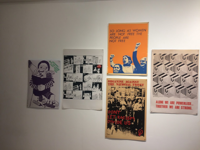
PPP SB2 - See Red - Womens Workshop exhibition


SEE RED

Village Bookstore held an exhibition of original prints taken from the book 'See Red- Womens Workshop' a book which showcases the feminist design work by the See Red movement, the posters touch on political and social topics from a feminist point of view. Each poster is unique and takes on different styles of the different women involved in the group. The posters are still relevant today with topics which were being fought against back when these were made (late 70's - 80's) are still conflicts today. The posters take form through, screen print lithograph and other means which were available to the group. The exhibition made me realise how design can be used as a voice and how strong messages can be put across, design doesn't have to sell something, it can be a powerful force for positive change, this will help and influence my design styles and choices for upcoming briefs. Briefs such as OUGD505 ethical design.

Wednesday, 15 February 2017

Max Huber Book


Having been influenced by a number of books this year a notable mention of an inspirational designer would be Max Huber, his playful swiss work has influenced me hugely this year and this can be seen through a number of pieces I have produced this year. Through context of practice I have played with type form and layout just like Huber does, using large bold san serif letters to create clear bold imagery. His use of colour is admirable and sometimes wild, though through the 60's and 70's while Huber was most active these were the styles which were popular and he was at the forefront of this popular aesthetic, I want to experiment a lot more with colour, in my own practice I tend to use a very limited colour pallette, though this is inspired by other swiss styles and swiss punk artists. Huber merges type, colour and photography immensely well combining them with ease to produce bold clear compositions which get across the message in such a way that it seems over simplified, where as it is just good, straight forward design, helped to pop with bold colours and playful layouts.


Friday, 10 February 2017

Footprint studio talk

James & Claire of Footprint visited the studio to discuss what they do at footprint and what Footprint stands for, such as ethos and the values that footprint believes in and what their clients believe in too.

Footprint is a workers Co-op meaning that the company is owned and managed by the workers with equal say about the runnings of the company. All profits generated by the work done is shared out to the workers, the set up is run like a democracy with everyone getting a vote on how things should be done, all decisions are made for the good of the company and because it is a good idea. Footprint heavily believe in co-op form of company set up and it has made the company sustainable and has stood the test of time, while also keeping the workers happy. Doing things because it's a good idea.

Footprint began in 1990 as a print house by hippies and punks and has remained with similar minded people today. Footprint use Riso printing for 90% of work they do, it is a style which is like a Digital form of screen printing using environmentally friendly inks. Footprint only ship in the UK to reduce their carbon footprint having to ship internationally. A percentage of their profits goes to charitable organisations and the company recycle everything they use this can include printing equipment some of which they acquired from Japan which is made out of banana leaves.

Footprint can choose to turn away work which they do not agree with or if they think the work will oppress or exclude someone, the DO NOT work with conservatives and any form of Political-party though they have printed politically charged works. Their clients include artists, other Co-ops, publishers and students. They remain in business due to repeat regular customers and keeping a good relationship with clients.

Footprint or involved with a number of print and zine fairs including Leeds Zine Fair where they take printing equipment to the fair and ask other creatives involved to donate a singular page, Footprint gather these together and form a zine to celebrate the fair.

YCN & Thirsty Planet Talk

You Can Now - Since 2001 is a curated creative network who host a huge amount of events in their space in Brixton London, their network is very substantial and its members include;

Alice Bowsher - Illustrator
Carol Sachs - Photographer - Converse
Jack Hughs - Illustrator
Patrick Fly - Graphic Designer

YCN use the slogan 'Connect, learn and do new things'

Brands;

- Lush
- Arsenal
- Green Peace
- Adidas

How do YCN Help brands?

YCN link brands with creatives who will help them with branding or campaigns saving the brand from having to look through hundreds of choices, YCN creates simple connections between brands and handpicked creatives.

Connecting people with new clients as well as hosting learning and development events with creatives and professionals. Hosting mixers and contextual/ inspiring/ educational talks.

YCN Student Awards -
Forward thinking Brands Judged by companies who set the brief without bias.

Advice - Get all ideas out on paper
competitive market research

DO NOT BE LIMITED BY THE BRIEF.


Thirsty Planet - 
Talk by Nicky Cain - Marketing manager of Harrogate spring - Thirsty Planet

Harrogate spa is the original British water, first bottled in 1740. regarded as the home of British Water, in 2007 they started the 'Thirsty Planet' project which would raise money for famished families around the world, particularly Africa, in 2010 they had raised 1 million for the project and now in 2017 they have raised there 2nd million, so far bringing clean fresh water to more than 1.35 million people whilst also guaranteeing a fixed donation with every bottle which allows a sustainable delivery program. Thirsty planet is responsible for producing their products in the most environmentally friendly ways.

Emphasis on Position - Worked with ASDA in 2007 yet with the price of water rising and financial reasons on ASDA's side the partnership ended. Thirsty planet only work with companies and brands which carry the right ethos and message.

Thristy Planet would like to see their brand compete with other regular water brands. Though they're a charity brand they want to be seen to be just as good as brands such as Buxton, Strathmore ETC.

Studio 12 & Buttercrumble Visit

STUDIO 12

Studio 12 is an open educational studio set up in Leeds Central library, studio 12 aims to support 16 to 30-year-olds from disadvantaged backgrounds. They have a number of resources for use such as a great photography space, a recording studio, green screen and a large mac suite.

With many different resources, the studio offers a range of things for its clients and pupils, they make sure that the people they take on are people who are passionate about the work they want to do and about their own culture and background. The studio is set up to be able to engage with young disadvantaged young adults of Leeds and Bradford, many of the people who go to studio 12 have had tough upbringings and who have been failed by the education system.

Studio 12 aim to offer a unique learning experience using new technology as well as non-digital resources to, encouraging traditional forms of creativity. Studio 12 have worked on numerous projects to challenge young people to be creative and recognise their backgrounds and culture one notable project being 'Writing Britain' a poetry and stories project aimed at disadvantaged children to speak about upbringing and the struggles which some of these students went through. Studio 12 also worked closely with British art show 8 on a zine brief designed to empower girls to learn design skills and get into the industry, the zines were focussed on showing the photography and literature of these girls and many of the entries looked at the struggles of being dual nationalities.

Growing up North was a project which asked why northern students wanted to move south and focussed on students from Leeds and Bradford, who have the ambition to move out of small northern towns to big Southern cities, yet the project challenged these students to embrace their hometowns and look at them in a different way.

Discussing opportunities to work with studio 12 the class have been given an opportunity to partake in a zine fair which will take place in Leeds Central Library, the fair is now taking entries for zines which look at Leeds' heritage and culture this is another project by Studio 12 which gives the opportunity for people across Leeds to access design and literacy.

BUTTERCRUMBLE

Buttercrumble is a Leeds based design studio which is made up of sisters Abigail and Chloe, originally from Scarborough, moving to Leeds to study. They started their own design studio based on 3 key values -
Smile - Make work which makes everyone smile and that clients and audience will like.
Foundations - strong foundations throughout everything including work, start off strong and build up.
Collaboration - Collaborate with all sorts of people to get more understanding of different styles of design and to open up to new things.

Notable projects-

Leeds Indie Food Festival - Cafes of Leeds
Old Red Bus Station - Wander exhibition
Independent Leeds Magazine - issues 4, 5 and 6
Kirkstall Art Trail branding 2016
Garforth Zine Workshop & Festival 2017

Buttercrumble emphasised the importance of collaboration saying 'Work with ones outside of your discipline and join creative forces' this is very apt and important to remember for all work undertake, especially in responsive projects which require collaboration, be open and be interested and the work will be really interesting. Approach - personalise, contribute and excite.