Saturday, 27 February 2016

Watchmen

One thing I draw huge inspiration from is Alan Moores award winning graphic novel creation Watchmen. Watchmen centres around a group of vigilante crime fighters in an alternate 1980's America, where war with Russia has escalated to boiling point and Richard Nixon remains president of the USA. In this alternate time stream masked heroes are a norm and have been outlawed and until one of the former masked heroes is murdered it brings them out of retirement to solve the crime. The novel looks a things such as drugs, politics and sex, it reads like an actual novel and not a graphic comic. 
The idea and art direction behind the book is raw and interesting, it creates a whole alternate universe. Moore used the story as a mean to reflect contemporary anxieties and to deconstruct and parody the whole superhero concept. Watchment depicts an alternate history where superheroes emerged in the 1940's and 1960's, helping the united states win the Vietnam War. In 1985, the country is edging toward nuclear war with the soviet union, freelance costumed vigilantes have been outlawed and most former superheroes are retired. The story focuses on the personal and moral struggles of the protagonist as an investigation into the murder of a government sponsored super hero takes them out of retirement.
Creatively the focus of Watchmen is on its structure. Gibbons uses a nine-pannel grid layout throughout the series and added recurring symbols such as the blood-stained smiley face. All but the last issue feature supplement fictional documents that add to the series' back story, and the narrative is intertwined with that of another story, an in-story pirate comic Tales of the Black Freighter, which one of the characters reads. Structured, at times, as a nonlinear narrative the story skips through time, space and plot. In the same style, entire scenes and dialogue have parallels with others through synchronicity, coincidence and repeated imagery.


The Dark Knight Returns

One big inspiration within my work is graphic novels, one of my favourites for its artwork is Frank Millers award winning graphic novel The Dark Knight Rises, a Batman story of his older self where Gotham has again plummeted into depravity and the Batman is forced to come out of retirement, where he then battles superman (the movie Batman Vs Superman which comes out in 2016 takes huge influence from Millers 1986 masterpiece).

The illustrations are produced by Miller and Klaus Janson, german born illustrator who works for both DC and Marvel comics, his involvement in Millers work is what he is most well known for. The style is dark and rough which goes along with the story of the aged super hero and his struggle, the use of colours is always relevant and interesting.

Miller was recruited to create The dark Knight Returns, Giordano said he worked with Miller on the story's plot and said "the version that was finally done was about his forth or fifth draft. The basic storyline was the same but there were alot of detours along the way" During the creation of the series, fellow writer John Byrne told Miller "Robin must be a girl" Miller complied and wrote in a teenage girl as Batmans sidekick. Miller said that the plot was inspired by Dirty Harry, specifically the 1983 film Sudden Impact, in which Dirty Harry returns to crime-fighting after a lengthy convalescence. Miller said his own increasing age was a factor in the plot.


Design Process


- Demonstrate
- journey
- Experiment
- Investigate
- Question
- Create a problem to solve
-think outside the box
- Start on Pen and Paper with ideas
- Ask questions
- Be clear

Daft Punk Documentary - BBC 4

I recently watched a BBC4 documentary which followed the career of French musicians Guy-Manuel de Homem-Christo and Thomas Bangalter, better known as Daft Punk. The documentary had experts commentating on certain defining moments in there career and paying homage to the electro musicians. It looked at there very early beginnings as children playing with simple technology making sounds and remixing using very low tech equipment, and how they went on to create there own sound playing in french clubs and using only there made music rather than sampling other peoples, the two boys had a innovative fresh approach to producing music.

The documentary looked at the inspirations of the band and that they were brought up on the guilty pleasure songs of the 70's, bands like Earth,Wind and Fire and CHIC, there style can be seen in alot of the work they produce. All of there hard work goes into the music and there heart, all the money they make gets reinvested back into the art and music they produce, as they live humble lives. They have managed to remain humble by performing there music masked, being known well now for there iconic robot personas, this helps them to perform live and keep a humble life with there families.

Leiji Matsumoto

Leiji Matsumoto, a world famous animator and illustrator, known for his work in anime and manga cinema, is another huge inspiration to the french musicians daft punk and were able to work with him for a series of music videos on there second album Discovery. Matsumoto created a full story line and world to create a small mini series to go alongside the songs on the album, it followed a group of alien musicians and there journey after being kidnapped and turned human by an evil greedy corporation, the documentary showed how they worked closely with Matsumoto but also how he was very much in charge in the direction that the small movies went in. The results of this collaboration were really impressive and are hailed as some of the best album covers ever produced.


Collaboration -

Daft Punk are one of the most admired music outfits in the world, especially after there famed come back performance at coacella in 2006 after many critics said they were outdated. The pair produced arguably the best performance which has ever happened at the American festival. This performance lead to Daft Punk collaborating with artists such as Nile rogers, Kanye West, Julian Casablancas, and many more great musicians. One artist praised the bands dedication and passion to music and hailed there whole direction, the mystery and devotion to what they do, Quoting Oscar Wilde "Give the man a mask and he'll tell you the truth" saying that through there masked personas they let the music show there beauty and are honest with what they do.

Daft Punk remain a big inspiration to myself and my work, I respect there look and direction of music, there passion and love for what they do.


Lord Whitney - Studio Visit

Amy Lord Rebecca Whitney Conosiers of make believe Span genres Art directors Designers Prop builders Rankin Meeting people in London Network Go to London meet people Agencies clients Be nice to everyone Don't know who knows who Music video Polka dots Self initiated work Jack Hudson illustrator Producers Set builders 6 people Workshop in studio Tree house studio Christmas card designs Leeds Met Mighty boosh inspired Do what you want to do Enjoy it Experiment Bunker Music Manchester Young illustration award 2010 Octopus Perseverance Try everything Travelling art circus Working with comedians Takes time and persistence to create work Collaboration Photography Constantly feeding imagination Get ideas down Case studies - Lore of the north Art council funded (support creatives give grants ) Legends and folk lore Yorkshire Don't just look on Pinterest Built set on site in Leeds studio "Choose your own inventions" Precision book makers Book launch The wood beneath the world Leeds town hall Christmas grotto Team of 30 Creating a world Promotion Cross keys Logham alphabet Holly King oak King Tickets Mock n roll Collaboration Jack Hudson No funding 80s inspired album covers Created album through artwork got bands on board Exhibition in Leeds Clients Liverpool Tate Vogue Barclays London alley Missoni


I visited a talk being held by Leeds based graphic design studio Lord Whitney, the talk was run by the two co-founders of the studio, Rebecca Whitney and Amy Lord, thus the title Lord Whitney. The motto for the work they produce is 'consieurs of make believe' they did not want to be known for just one thing so continue to span the genres of creativity delving into areas such as, art directing, design and prop builders. One of there biggest achievements to date is there work with Rankin, the famous photographer. When asked how they got the opportunity to work with Rankin they said it cam about through meeting people in London, talking to new people and getting lucky, one point they wanted to make clear was to be nice to everyone you meet, be polite and interested in them and they will in turn be interested in you.

The pair spoke about how they started off at university being confused about what creative direction to follow and not really enjoying what they were doing in education as individuals. They were brought together through there love of tv series The Mighty Boosh, which inspired them to start creating, experimenting and enjoying being creative. After leaving university the pair got mundane jobs while remaining creative in there spare time, creating sets in there basements and photographing the results and adding it to there portfolio. They remained in touch with there university friends who would help them with there self made projects, all of whom now made it in the creative industry, being designers, illustrators and more.

They spoke about there experience of making it winning young illustration award in 2010 and travelling to Germany to exhibit there winning piece. Talking about collaboration and how important it is, and how to always get ideas down and to feed the imagination.


Thursday, 25 February 2016

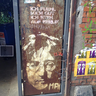
Berlin


During the summer of 2015 I visited Berlin with some friends, having looked at Berlin based designers throughout my college years and really wanted to visit to see the history, art and culture of Germanys capital. Luckily I managed to find a couple of people to go with and so booked the trip with staying in a hostel for a week, to meet new people and then for the other half of the trip spent in a small flat in the suburbs of Berlin city. When I got there and experienced the public transport to the hostel I found the views and the people who I met so nice, I realised so many difference between countries within 15 minutes of arriving. In the hostel we joined a pub crawl and met people from around the world who were travelling Europe, I got to experience and speak to a number of different people from a range of backgrounds. On our first full day we visited a number of landmarks in Berlin such as the Brandenburg Gate, the Holocaust Memorial and a number of historical buildings such as the Reichstag. Whilst at the holocaust memorial site I was moved by the sheer scale and solemness of it, it was a very humbling experience of the site of the work by architect Peter Eisenman and engineer Buro Happold.


During my time in Berlin I got to try out the culture and try the food and drink, It was such a different type of life than what we lead in England it is so cultured and interesting, the shape of the city and the amount of things that go on is incredible. I visited a graphic design studio and was only able to look through the window and in the courtyard of the design company but I saw some great things from just that. I would love to live there and hopefully one day work there, it has inspired me so much through what I saw and would love to one day to return.


Wednesday, 24 February 2016

An Essay on Typography - Eric Gill


Eric Gill's well known opinionated book on typography looks at the role type plays in day to day life and the ever changing culture of the times when it was written (1931). Gill talks a lot about craftsmen in an industrial age, arguing that anyone is an artist if the term is meant literally, drawing comparisons from the builder and his tools to the painter and his. Eric Gill was an English sculptor, print maker and typeface designer born 1882, his work in the early 20th century still innovates and inspires graphic designers today. His essay on typography, is an interesting and sometimes funny read, it opened my eyes to the cultural difference and startling similarities which have been in place for years within the world and its view on creatives and the what makes something art and someone an artist.

ANORAK

I visited a talk lead by the editor of ANORAK magazine, an annual children's magazine which follows its own style and remains completely unique in comparison to other children's magazines available on the market today.

The editor and founder of the magazine, which celebrates its 10th year, went through the idea behind the children's magazine and the whole art direction which they followed, having a strong ethos to be fun and colourful whilst also being informative and educational, having an individual theme for each issue. For example issues such as 'Tudors', 'Friendship' and 'Inventions', the magazine has, in more recent issues, chosen to publish more philosophical themes such as dreams, courage and happiness.


Each issue is bright and bold to catch the eye but also unhindered by gender focus, its main priority is to appeal to children, creating a new innovative, exciting cover for each issue. For each issue they bring in a new illustrator to design the cover and to illustrate within on the stories, some which were mentioned during the talk are:

Super Mundane- 

SuperMundane - an illustrator from London. Often using bright colours and shapes, supermundane recently produced a piece for Leeds City Train Station which is on show above the platforms.


Lauren Humphrey - Recently graduated Illustrator based in London. Her style perfectly suits the aesthetic of ANORAK magazine, bright bold illustrations. For someone still young she boasts an impressive list of clients who she has worked for such as ANORAK, the new york times, the guardian and more.

The Editor of the magazine pointed out a number of different stories published within, specifically ones which she loved her self. One for example is the 'Jim and Jam' story, the illustrations within this spread is very neat and visually pleasing, one which I thoroughly enjoyed seeing.


The editor also discussed an upcoming event happening at the Yorkshire Sculpture Park on the 1st and 2nd of April this year, called the Drawing Imaginarium, a family event which will run a number of workshops with illustrators from the ANORAK magazine running them. I want to visit this event and see how these creatives work and what I can learn from them.


Instagram Account


With my work I like to keep a social presence through an Instagram Blog. I use this to post my own work and on going practice and also pieces of art, music or aesthetic which interests or inspires me. Not only to show my on going practice, I also use Instagram to look at other accounts and find new work to inspire me. I look at a number of creative accounts which then lead me on to others. 


Hey Studio - a studio based in Spain, Barcelona they work alot with type and strong colours which I find very inspiring, they have a very unique look of bold work. They use bright colours on most of there work, to produce striking work. They are a very active account and also like a lot of work of other studios and of individual designers work.


DesignForToday - A designer who posts his own work and work which inspires him, his posts all have a similar aesthetic and style and his blog flows really well. The work on show on the account is usually bright illustrative pieces. Posting once or twice a day, it is a very active, fresh and interesting account to follow.


The Family Rain - One of my favourite accounts on Instagram is the band the Family Rains, there style and aesthetic is seen through there photographic blog, they post them recording in the studio, the art work for gigs and also art work and music which they like. There style is very interesting and they also produce all the art work for there gigs and albums.


Tuesday, 23 February 2016

Inspiration - Rost Berlin


One artist I was recently shown and have become a big fan of is a designer called Rost, specifically his Berlin set of work, which is inspired by Japanese Manga and is a style which has inspired some of my recent work. The use of colour and shape is really interesting it is so subtle yet full of detail and the mood is bright and clear, you can see the way the colour sets the tone of the image, the use of a small which box to hold type sets perfectly aside the work.


milpool band


Again being influenced by music I did some work for a local band called 'milpool' who wanted a bright happy swiss inspired design. I wanted to show the band through the poster, a young bright fresh band, i wanted to have the sunny feel within the poster yet also keep it simple, which is why I produced this style of poster above which was used for their free gig at headrow house.

The Family Rain


Being heavily influenced by music within my work I love to produce design work for bands. One in particular to mention, I got to produce for my favourite current band The Family Rain, producing art work for the release of there latest single 'What are you afraid of?' being inspired by a number of different styles including an american style of which the band like to use and also of flash advertising, big bold type posters to be posted around a city to make people remember, the band used a similar to style to this and credited my work on social media.

personal work - Humorous book covers


During my studies I try to do some personal work to keep my mind fresh, during the winter break I looked alot at Marber grids and classic looking penguin designs. Having looked at these styles of 1970-esque retro designs I wanted to produce something similar for my own pleasure. Whilst trying to think of designs to do I was inspired by a scene from an episode of 'Father Ted', one particular part was when one of the characters is reading a book called 'Gary Lienekers Ghost stories' I made a couple of small book covers inspired by this silly humour and looking at retro footballers.


Monday, 22 February 2016

PPP -

My personal interests-

Music
Film
Dark colours
Travelling
Germany
comedy
doc martens
guitar
swiss design
japanese design
German design
Book cover design
album cover design
Mustard Colour

PPP Study Task 2

Self Branding-

Design, develop, produce self branding which represents you as an individual, designer and learner.

relevant and inform design decisions, highlighting and reflecting my learning aspirations.

Abbas Mushtaq
The clocksmiths
James webb youngs 5 step process
Paul Arden


Get Things On Paper